Button Widget
This section provides examples demonstrating various configurations and states of the Button widget. Each example includes the relevant code and a visual representation of the result.
Basic Button
A simple button with a text label.
Code
rcnew Button{ rcnew Text{ "Button" } }
Result

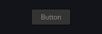
Disabled Button
A button in the disabled state, visually indicating it cannot be interacted with.
Code
rcnew Button{ rcnew Text{ "Button" }, disabled = true }
Result
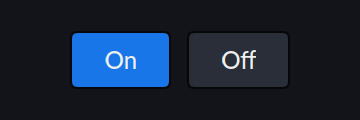
Toggle Buttons
A row of two toggle buttons, one in the "On" state and one in the "Off" state.
Code
rcnew Row{
    rcnew ToggleButton{ rcnew Text{ "On" }, value = true },
    rcnew ToggleButton{ rcnew Text{ "Off" }, value = false }
}
Result
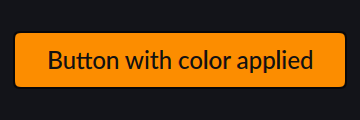
Button with Color
A button with a custom color applied.
Code
rcnew Button{
    rcnew Text{ "Button with color applied" },
    Graphene::mainColor = Palette::Standard::amber
}
Result
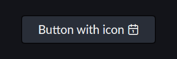
Button with Icon
A button displaying an icon alongside text, using an icon identifier.
Code
rcnew Button{ rcnew Text{ "Button with icon " ICON_calendar_1 } }
Result
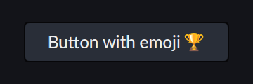
Button with Emoji
A button displaying an emoji alongside text.
Code
rcnew Button{ rcnew Text{ "Button with emoji 🏆" } }
Result
Button with SVG
A button displaying a custom SVG image.
Code
rcnew Button{
    rcnew SvgImageView{
        R"SVG(<svg xmlns="http://www.w3.org/2000/svg" width="128" height="128">
            <path d="M106.809 115a13.346 13.346 0 0 1 0-18.356h-80.9a4.71 4.71 0 0 0-4.71 4.71v8.936a4.71 4.71 0 0 0 4.71 4.71z" fill="#dbedff"/>
            <path fill="#f87c68" d="M42.943 105.82v15.873l-5.12-5.12-5.12 5.12V105.82h10.24z"/>
            <path d="M25.906 6.307a4.71 4.71 0 0 0-4.71 4.71v90.335a4.71 4.71 0 0 1 4.71-4.71h80.9V6.307z" fill="#64d465"/>
            <path d="M32.7 6.31v90.33h-6.8a4.712 4.712 0 0 0-4.71 4.71V11.02a4.712 4.712 0 0 1 4.71-4.71z" fill="#40c140"/>
            <path fill="#dbedff" d="M50.454 24.058h38.604v20.653H50.454z"/>
            <path d="M103.15 105.82a11 11 0 0 0 .13 1.75H32.7a1.75 1.75 0 0 1 0-3.5h70.58a11 11 0 0 0-.13 1.75z" fill="#b5dcff"/>
        </svg>)SVG",
        dimensions = { 24, 24 }
    }
}
Result

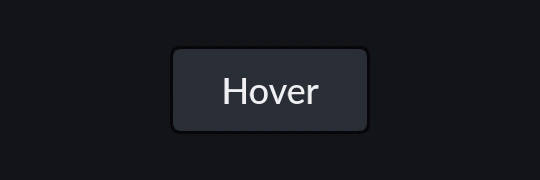
Button state animation (Normal - Hover - Pressed)