ComboBox Widget
The ComboBox widget is a versatile UI component that allows users to select one item from a dropdown list. It supports various content types, including text, colors, and any custom widgets. Below are examples demonstrating different configurations of the ComboBox widget.
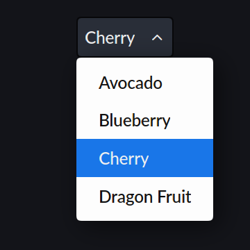
ComboBox with Text Items
This example shows a ComboBox populated with text items, where the user can select one fruit from the dropdown list.
Code
rcnew ComboBox{
    rcnew Menu{
        rcnew Text{ "Avocado" },
        rcnew Text{ "Blueberry" },
        rcnew Text{ "Cherry" },
        rcnew Text{ "Dragon Fruit" },
    },
}
Result
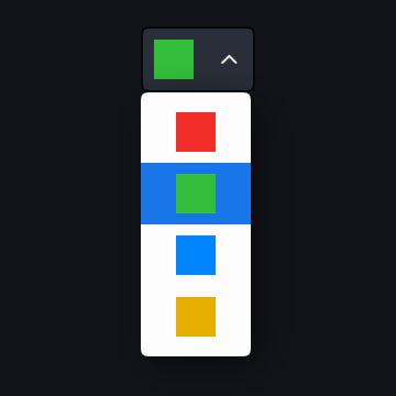
ComboBox with Colors
This example demonstrates a ComboBox with color options, where each item is a ColorView displaying a different color.
Code
rcnew ComboBox{
    rcnew Menu{
        rcnew ColorView{ Palette::Standard::red },
        rcnew ColorView{ Palette::Standard::green },
        rcnew ColorView{ Palette::Standard::blue },
        rcnew ColorView{ Palette::Standard::yellow },
    },
}
Result
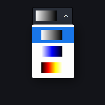
ComboBox with Custom Widgets (GradientView)
This example showcases a ComboBox with custom GradientView widgets, each displaying a unique color gradient. The minWidth property ensures the menu is wide enough to display the gradients clearly.
Code
rcnew ComboBox{
    rcnew Menu{
        minWidth  = 4.8_em,         // Minimum menu width (4.8 times the font size)
        rcnew GradientView{ ColorStopArray{
            { 0.0f, Palette::white }, // Gradient from white to black
            { 1.0f, Palette::black },
        } },
        rcnew GradientView{ ColorStopArray{
            { 0.0f, Palette::white }, // Gradient from white to blue to black
            { 0.5f, Palette::blue },
            { 1.0f, Palette::black },
        } },
        rcnew GradientView{ ColorStopArray{
            { 0.00f, Palette::black },  // Gradient from black to red to yellow to white
            { 0.33f, Palette::red },
            { 0.67f, Palette::yellow },
            { 1.00f, Palette::white },
        } },
    },
}
Result